Beth & Bryant
Beth had the most incredible vision from the very beginning. She & Bryant got engaged in Monet’s Garden in France & from there the ideas exploded!
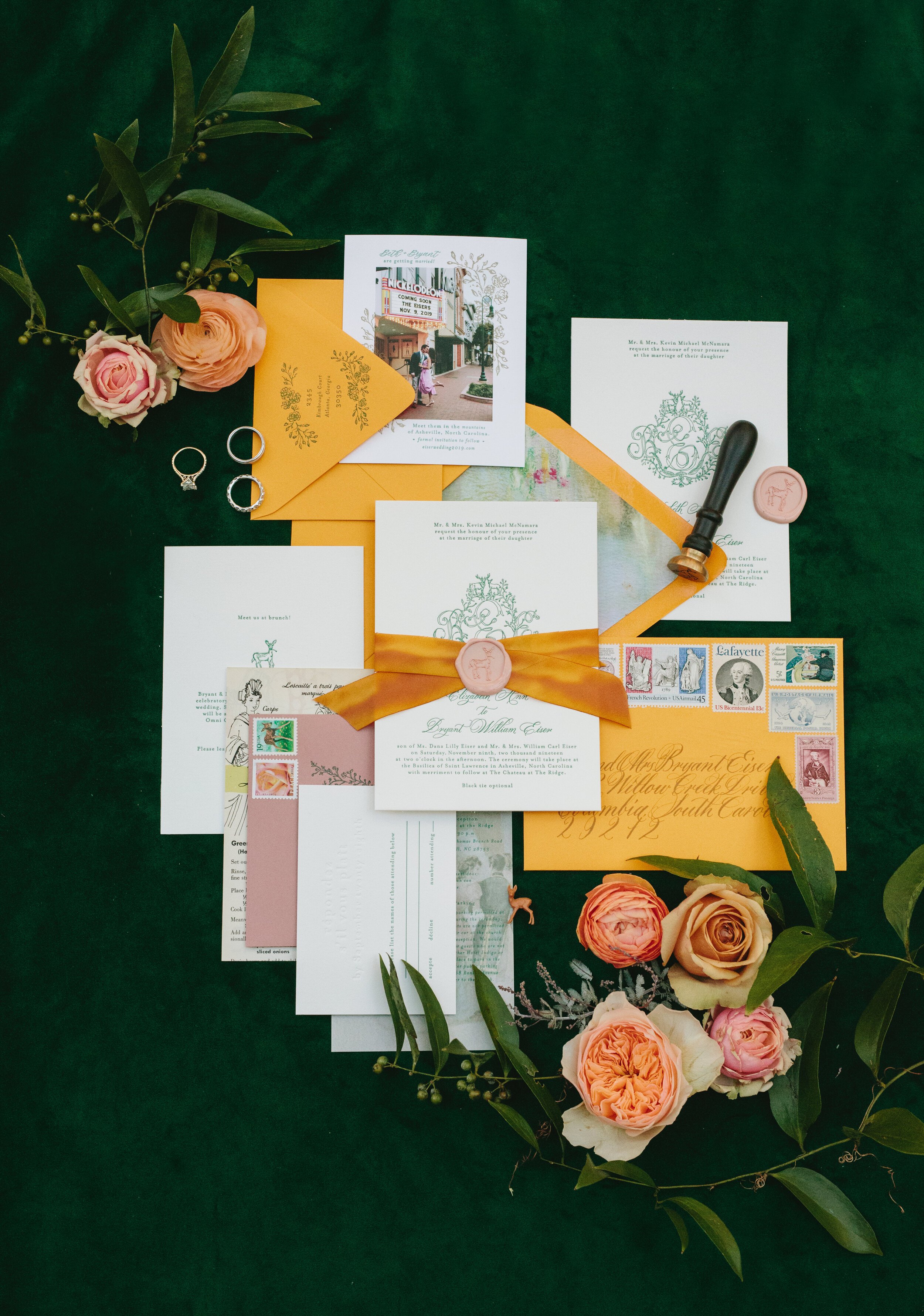
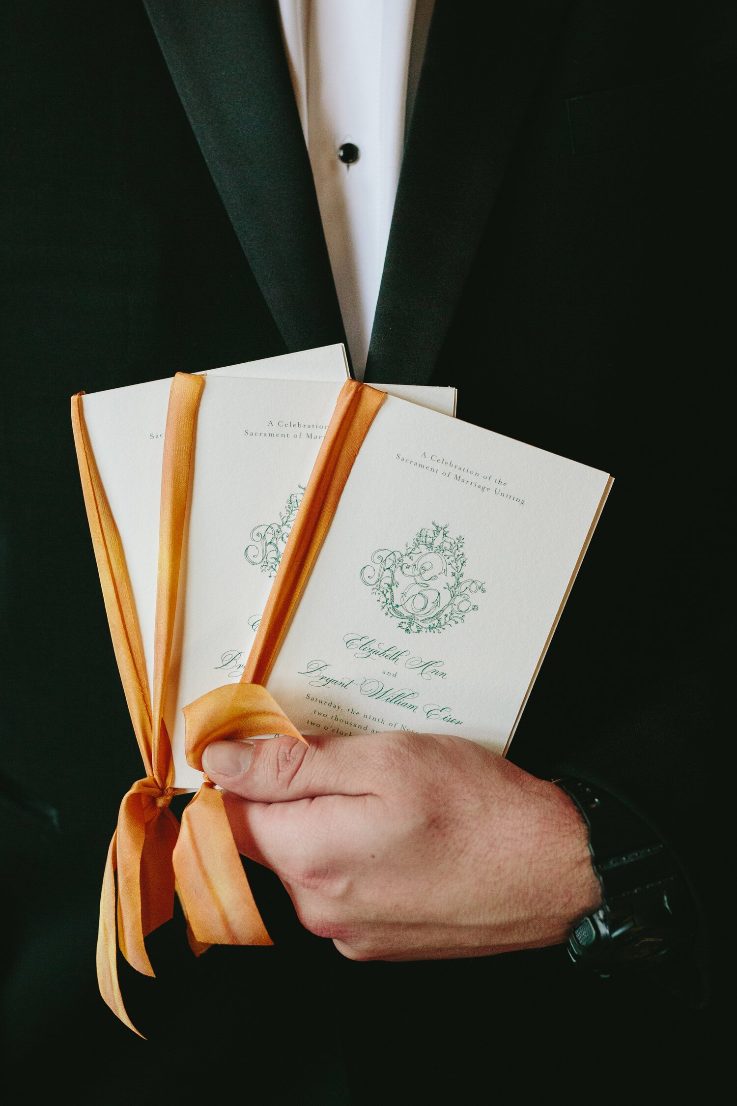
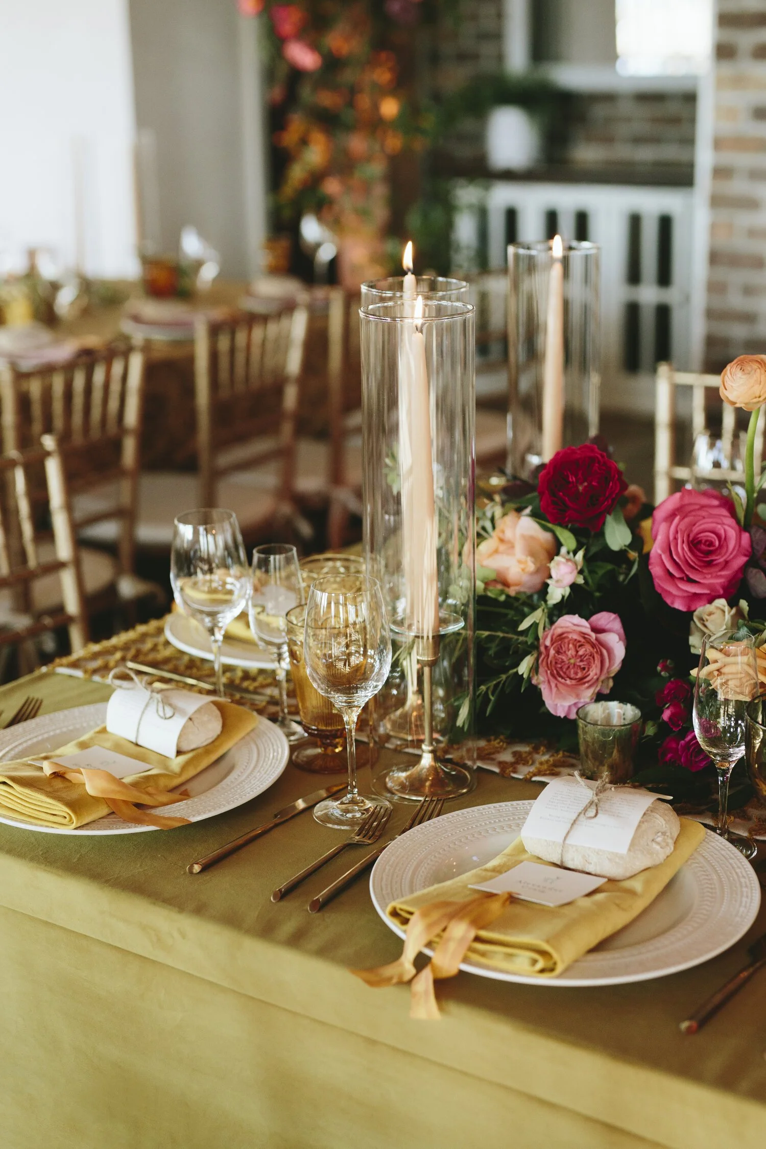
We first started with a lovely custom crest by Miles Purvis that was meant to be whimsical & loose. Beth described her wedding aesthetic as being hipster Asheville, but not granola. She also wanted lots of color included in the suite, the most two prominent being citrine yellow & emerald green. We incorporated the citrine by using it as an envelope, hand dyed silk ribbon & featured it in the day-of & rehearsal dinner stationery. Their brunch card included duplexed french cook book pages to include fun vintage text & illustrations. The other way we incorporated a true French aesthetic was in the vintage postage. Lots of guests thought the envelopes were sent from France when they opened their mailboxes! So many details were created in Beth & Bryant’s stationery that can be seen in the images below.
two ink colors - emerald green & blind deboss
Paper
• Crane's Lettra - cotton paper
• Citrine outer envelopes from Cards & Pockets
• Dusty Rose reply envelopes from Cards & Pockets
Additions
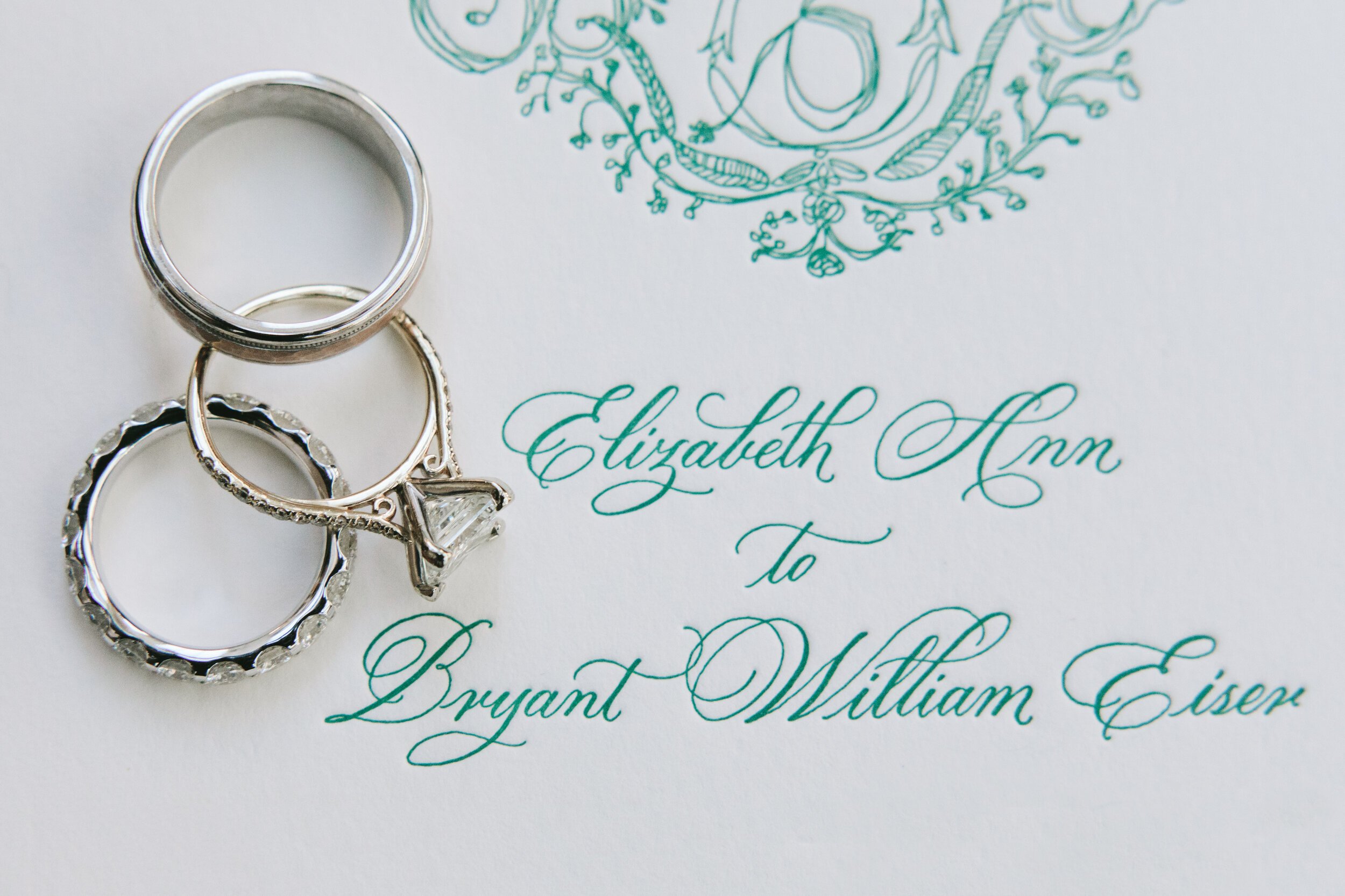
• spot calligraphy by Becca Anne Studio
• outer & inner envelope calligraphy by Becca Anne Studio
• vintage postage from Little Postage House
• custom vintage monogram, illustrations, Monet inspired artwork by Miles Purvis
• envelope liner in the outer envelope
• antique artwork used on the vellum details card
• brunch card on cotton lettra with duplexed French cookbook pages on the back
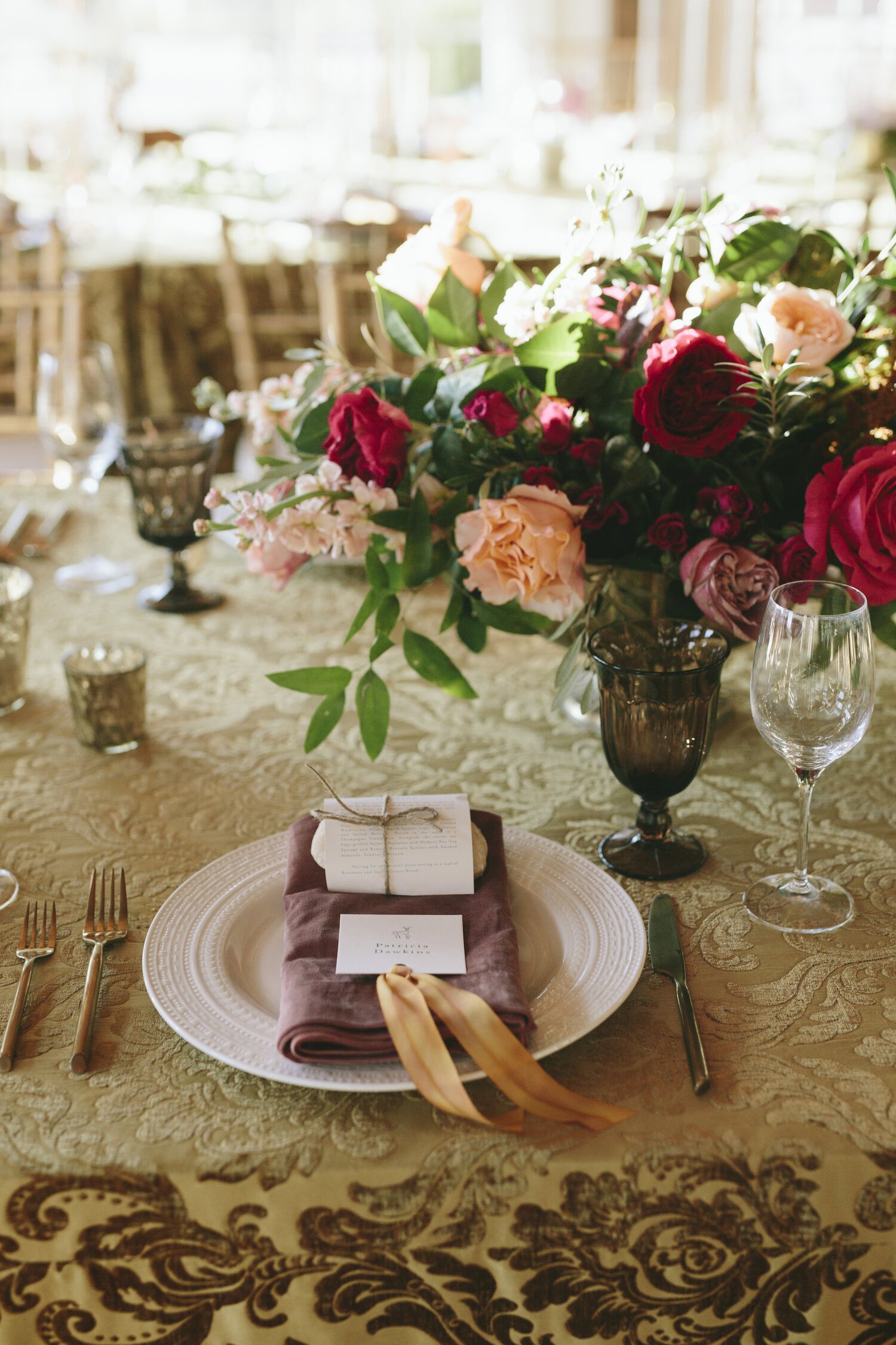
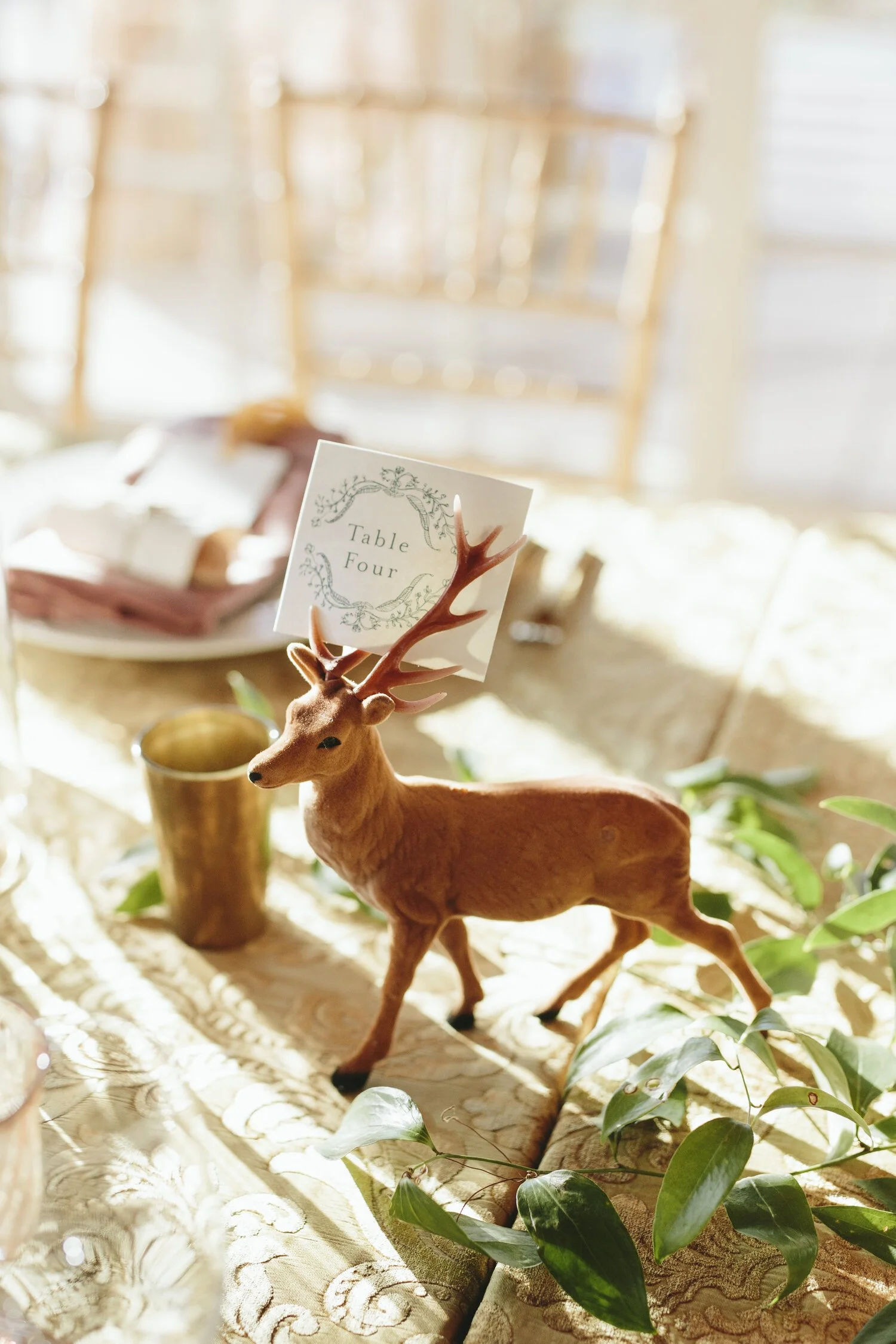
• various day-of items including double seating chart, place cards, table numbers, menus, programs, engraved welcome boxes & welcome box gifts